We go big for birthdays around here. I was calling a friend a few weeks ago who said her time living in New York was the most celebrated she’s probably ever felt, and she’s right…that we really love any reason to party.
This year was the big 3-0, so I wanted to go all in on something in the city. I was committed early on (like, months beforehand) to the concept of an art gallery: creating a space with interactive elements that people could enjoy even if they came alone. And something that would satisfy the regret of never taking that exhibition design elective in college. Having worked on the vendor side, I have a huge appreciation for all the details that go into an event, so read on to see what we pulled off with a non-brand budget, a lot of pre-production, and command strips. P.S. This email will get cut off in your inbox, so I recommend you open it up in browser/app now!
The more obvious venue choice was renting a gallery on Peerspace, but all the options felt a little too sterile. I chose Lee’s on Canal instead for perfect cozy vibes (that kitchen!) and ample space. Also: a HUGE thank you to Brooke for all the fab photos below and Echo for being my better creative half.
Good bones of a space are so important. I feel like people don’t exercise this discernment outside of house / wedding venue shopping. After I did my site visit, I sketched out a super professional map (above) to start visualizing my initial ideas.
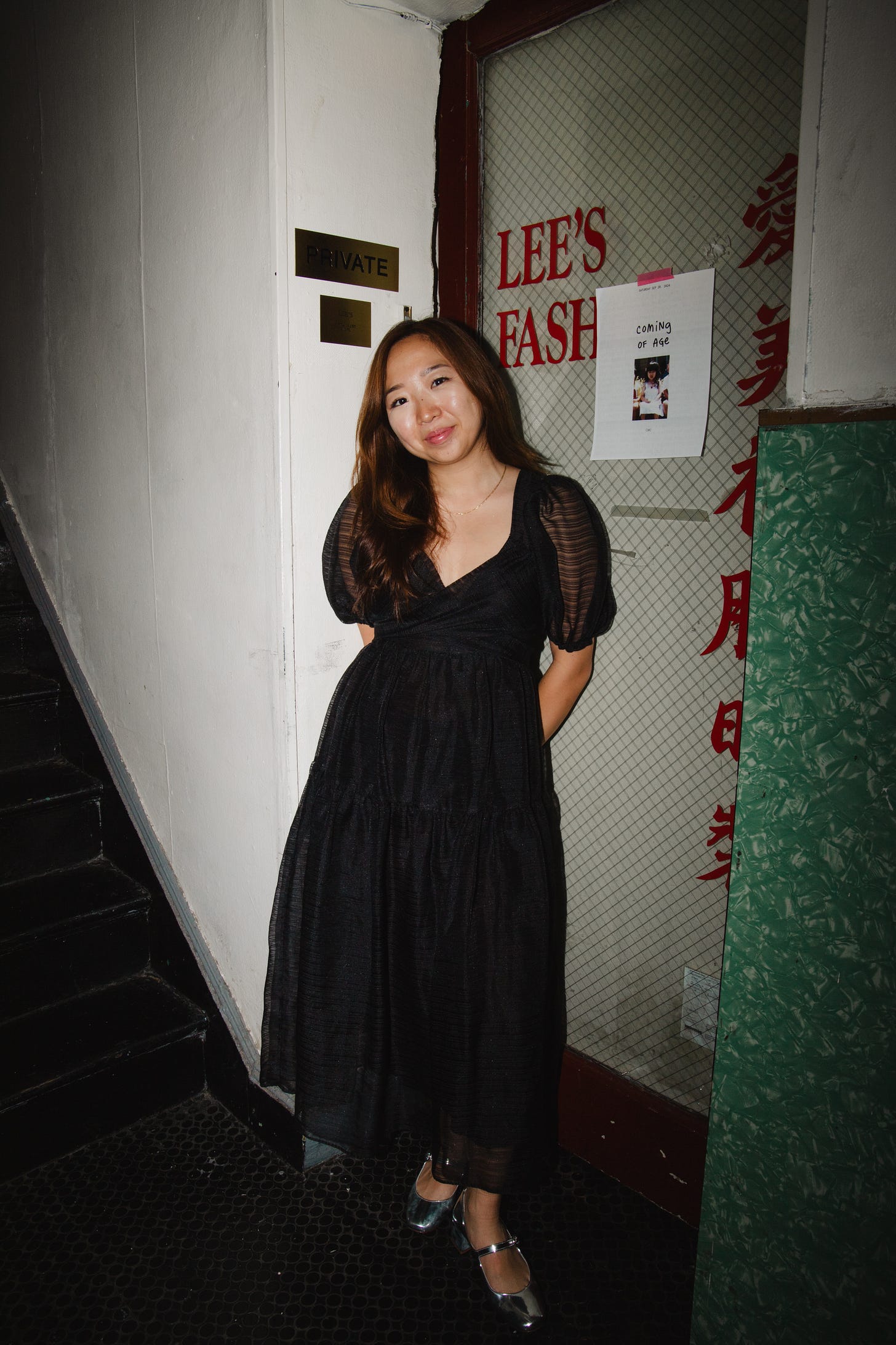
Onto the “pieces”…
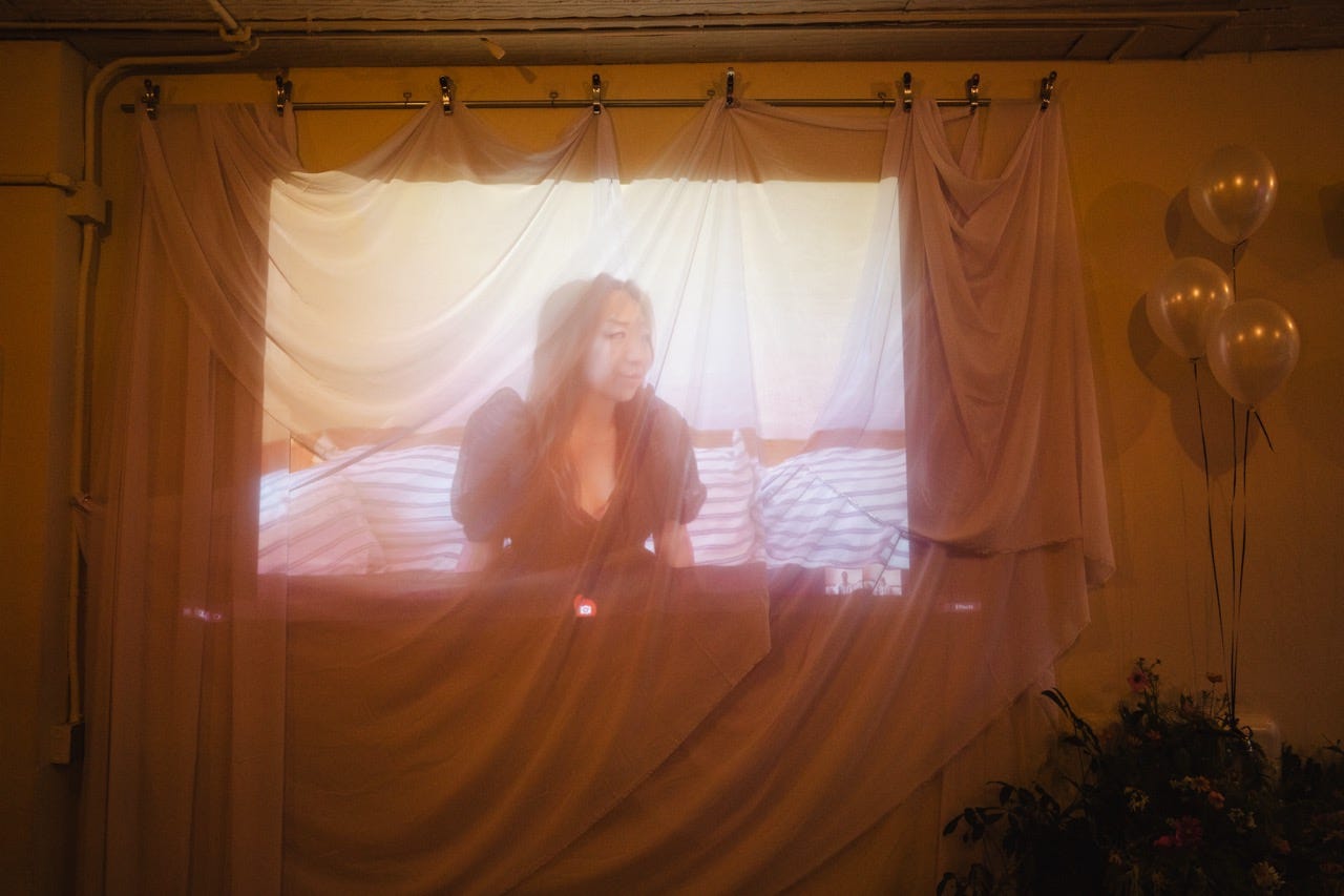
What I appreciate about moving image is how it can become the focus or backdrop of an entire space. This install was the true genesis of my entire party concept. There’s something I loved about the paradox of projecting a self-indulgent photo booth in such a public manner. Echo draped 60 yards of white chiffon on the projector wall while I set up my Macbook and additional lighting by the couch. You could hear giggles from the corner all night as everyone rediscovered Photo Booth filter nostalgia.
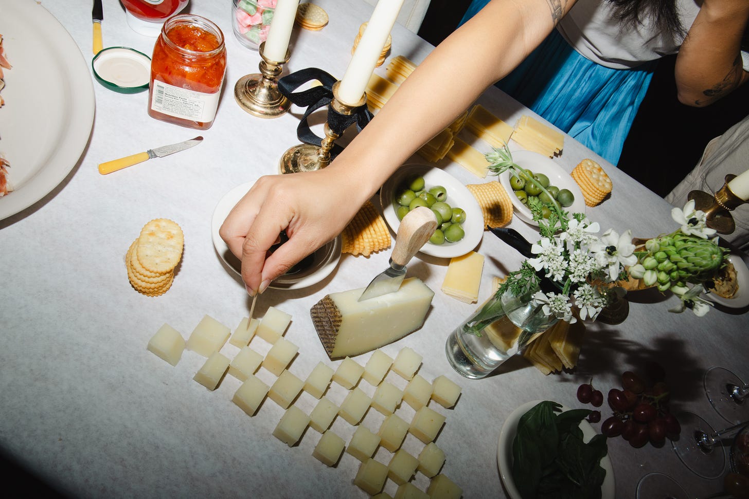
The funny thing about grazing tables is no one wants to be the first to destroy them. But an evolving form is sort of the whole point (and beauty) of interactive art. I gave Echo the direction of “food as play” and to make sure it was a little sculptural. Which resulted in the grape champagne tower and cheese checkerboard.
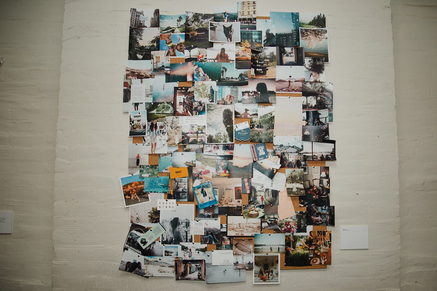
This was originally going to be a gallery wall, but it ended up being a much more feasible cork-foam bulletin collage. I printed and cut out my own photos from the last decade to pin up and create an Olympia Gayot moment. (I was stressing because I procrastinated on printing until day-of, but it was worth it for getting to retell backstories.)
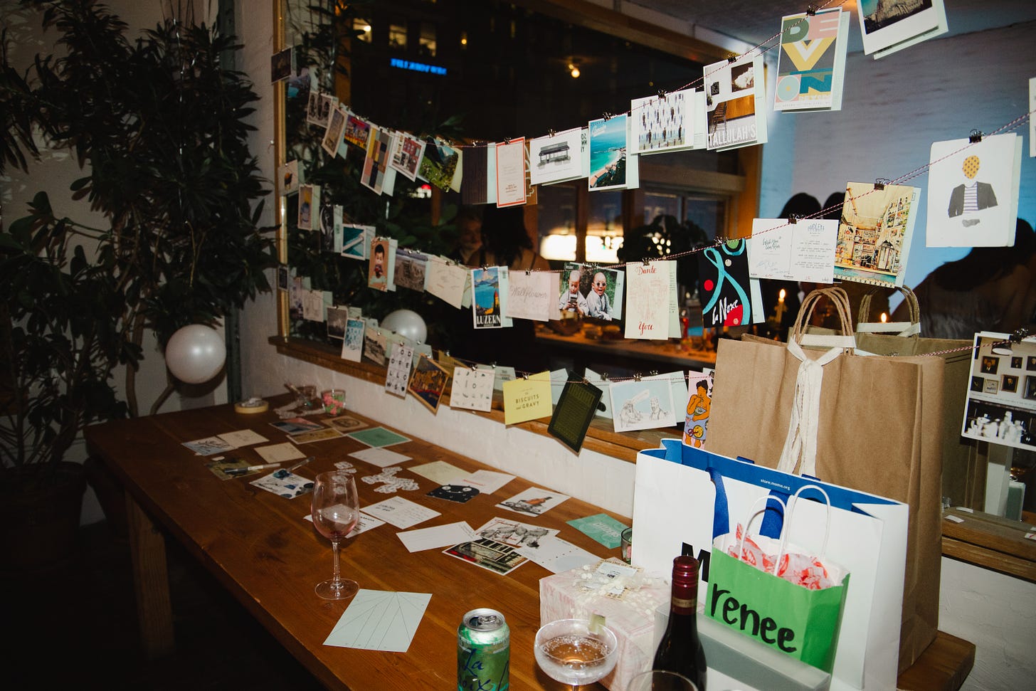
I started collecting restaurant postcards years ago with the intention of signing and dating them with my meal companions. But collecting is the easier part to remember, so naturally…many of them are still blank. We hung up an assortment with twine and silver clips and asked guests pick one out to write down a fave memory or a birthday wish. My collection feels that much more complete now, and it was so fun to see which ones people chose. (I keep every card I’ve ever received!)
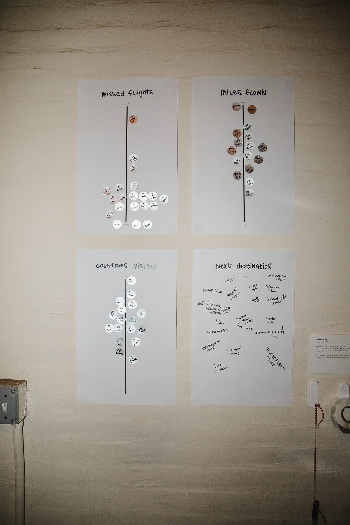
Another homage to my travels. This was 4 simple tabloid prints taped up alongside a Sharpie and roll of dot stickers. I asked everyone to take guesses and give me a suggestion on where I should travel to next. (In hindsight, this is also when I remembered people don’t read instructions...)

I had big dreams to print this on a giant fabric banner (à-la-wedding seating chart), but budget and timeline are sometimes good constraints! In the end, I liked how this compelled people to walk up and read it up close.
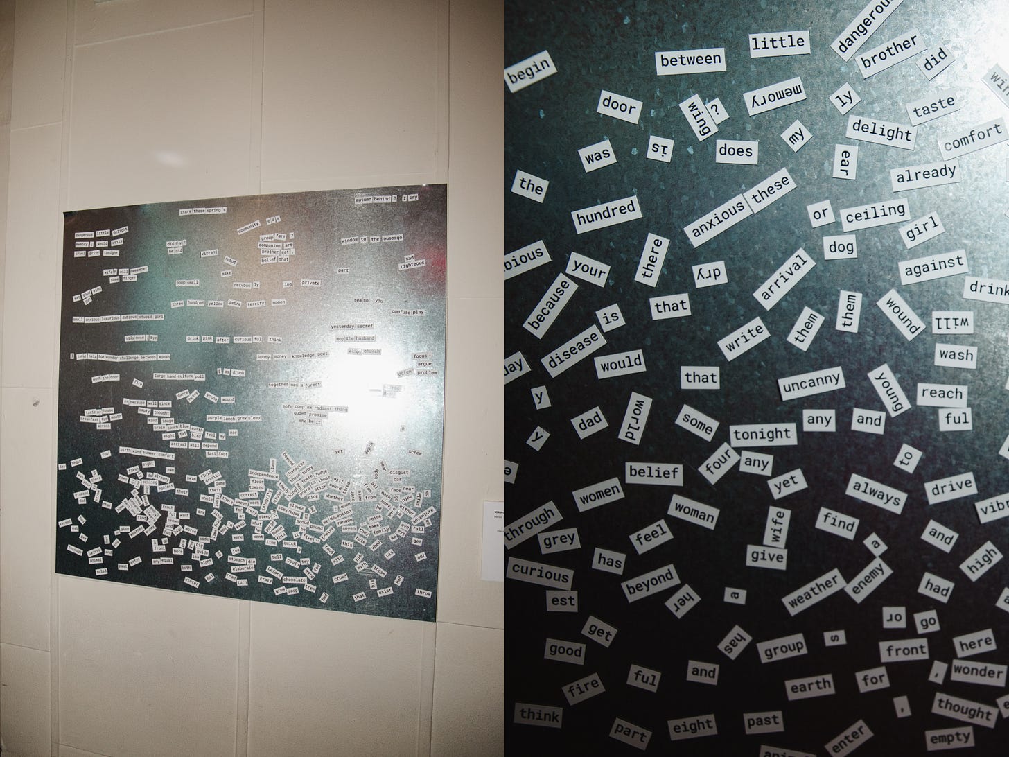
Because the fridge wasn’t an option (it would’ve been such a fun way to activate another part of the space), we made our own fridge door. I picked up a 36x36 sheet of metal from Home Depot and a set of poetry magnets. The description asked everyone to:
write me a poem
there are no rules except to do it with feeling.
less is more,
revisions: inevitable,
deconstruction: permissible
(encouraged)
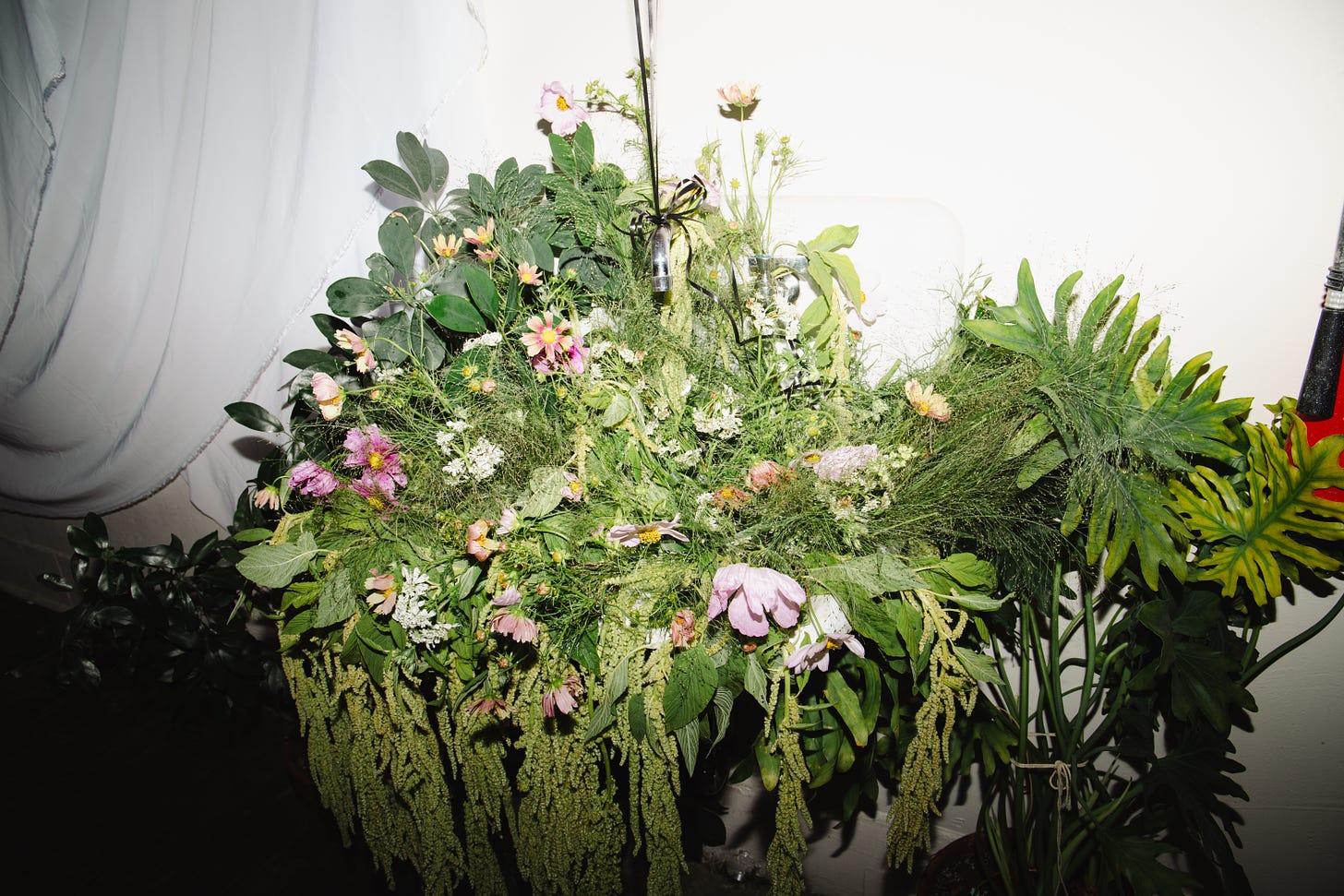
Okay, onto some other fun details. I knew I wanted flowers in the sink the moment I decided on Lee’s. We went to the flower market in the morning and picked out a fun assortment of explosion grass, green amaranthus, and pink cosmos.
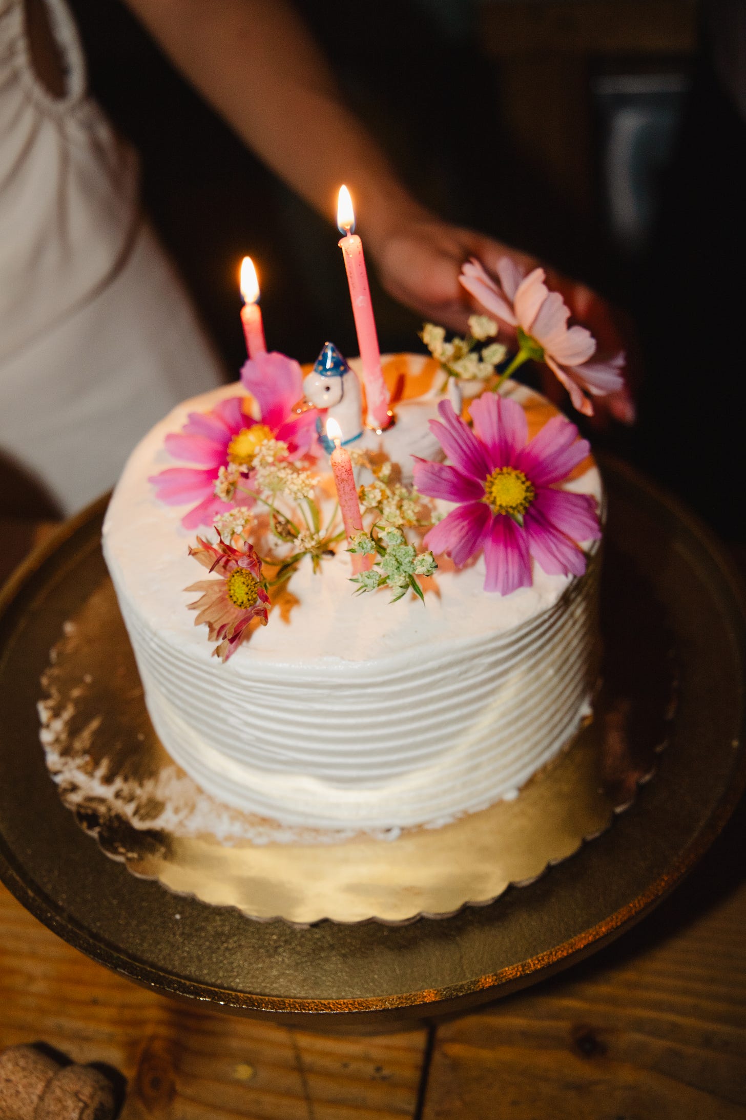
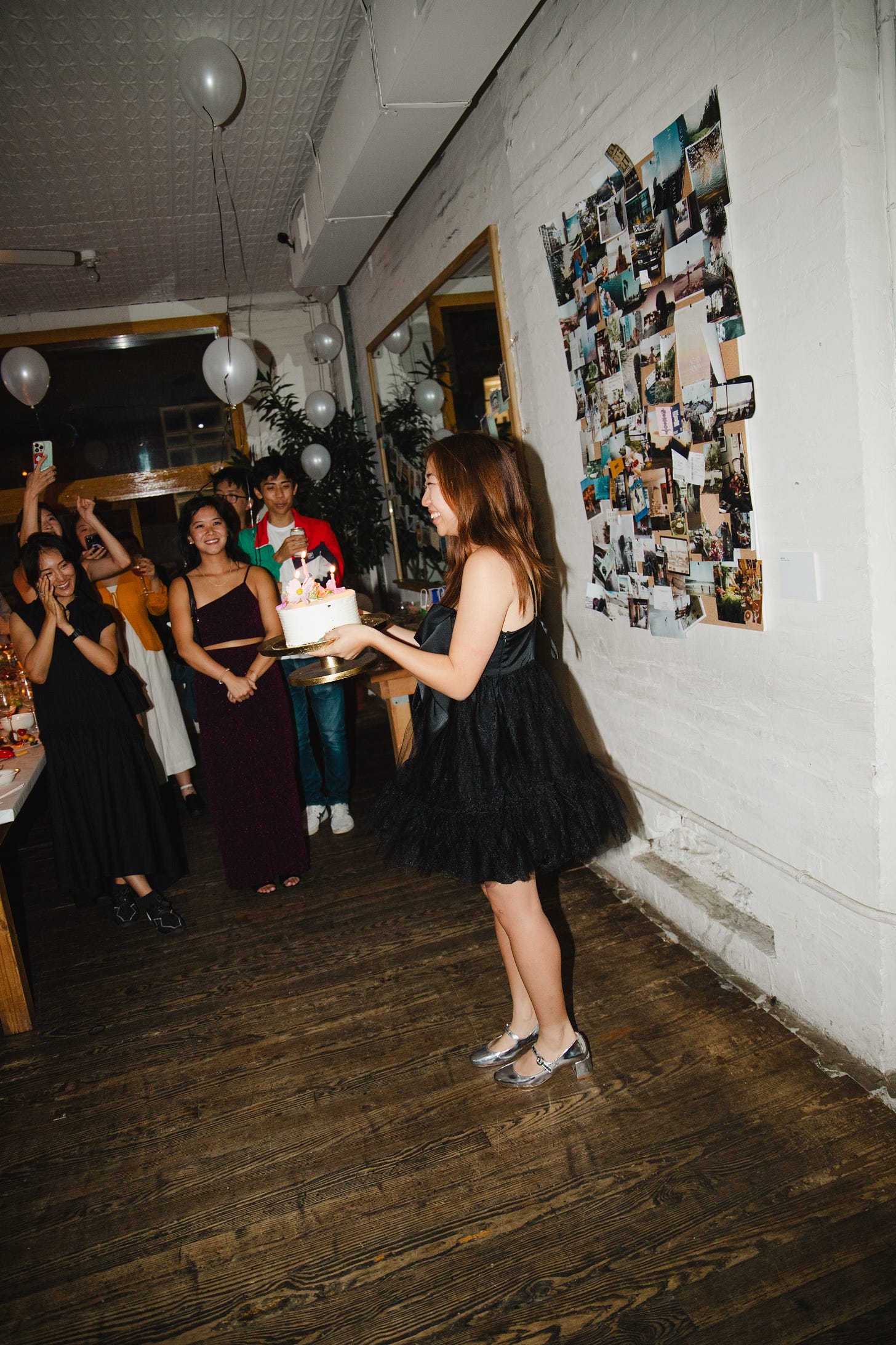
I almost nixed having a cake, but was convinced some traditions are indispensable. She’s a carrot cake from our neighborhood go-to (Mia’s), crowned with flowers and this cutie goose cake topper.

Since we had access to a full kitchen, I really wanted an “at-home” dessert option alongside the cake. Steph baked these warm chocolate chip cookies to serve à la mode!
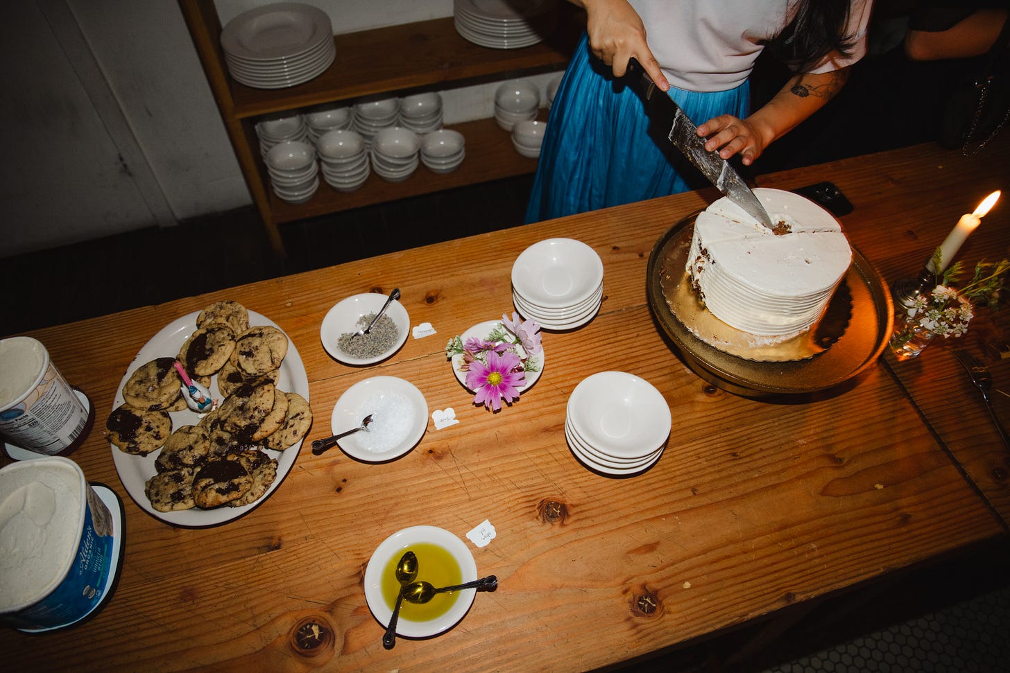
Other intentional details of note:
A mini-install: THE SOUNDTRACK TO MY 20S with a QR code pointing to a playlist collected from my Spotify listening history. In a dream world, I would’ve loved to set this up with chunky over-the-ear headphones and a narrated intro.
Die-cut stickers (party favor).
Wine picked up from Cobble Hill faves Brooklyn Wine Exchange and Talea.
Descriptions for each piece were cut and mounted on foamcore…so art school it hurts.
Dino nuggets served for a late-night snack (and stacked for a birthday candle at midnight).
I loved getting to party on Saturday night so I could enjoy my actual birthday: a coffee and breakfast taco, a solo pho and C.O. Bigelow afternoon splurge, and pasta with my high school bestie.
Planning your own party can feel intimidating and stressful, so I totally get why people skip out on it. But hear me out: a birthday is way lower stakes than a wedding! We could all use more reasons to get dressed up! And what else is better in this life than having people we love come together to be in one room.


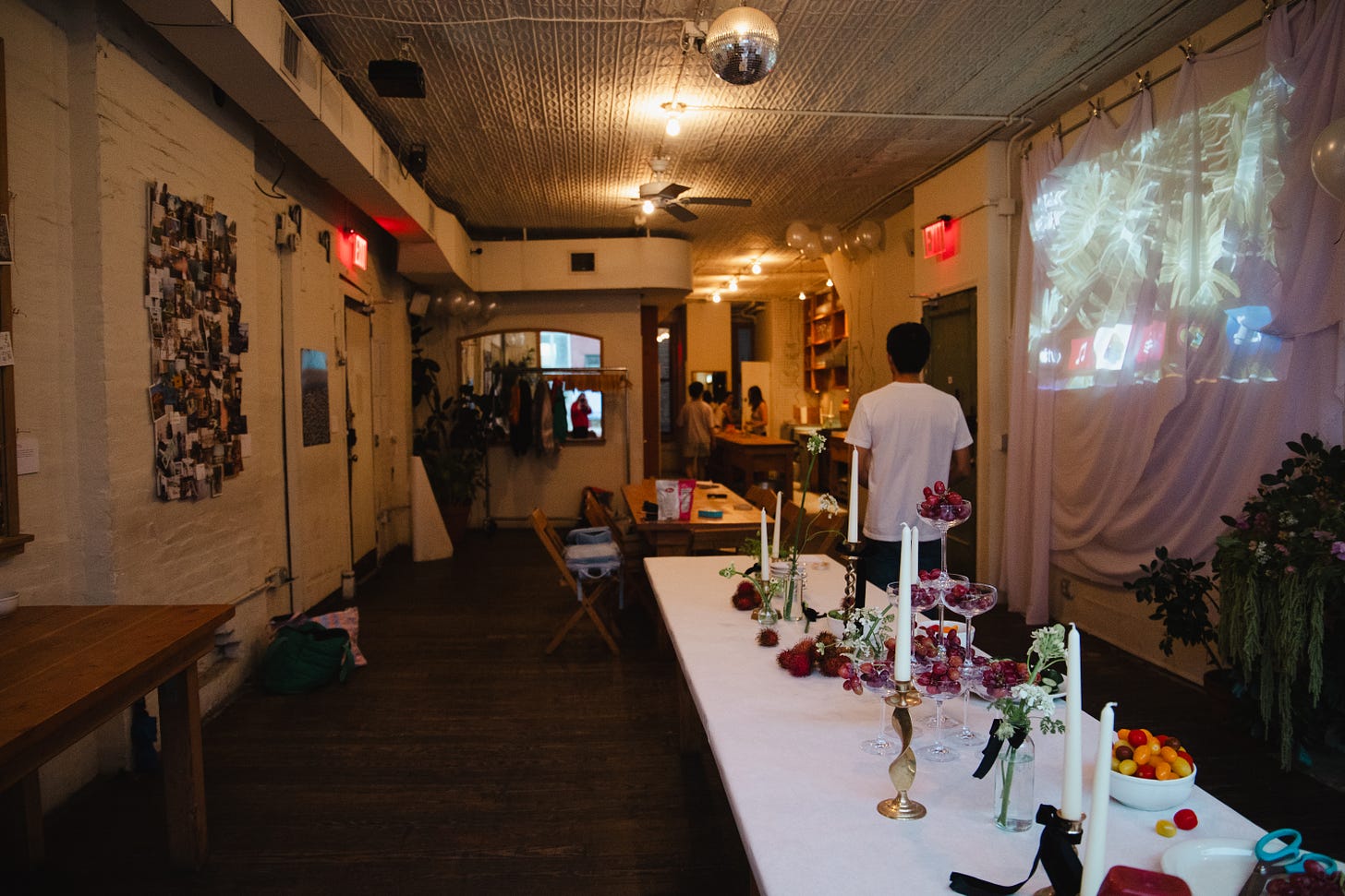


I thought "ok how serious can this really be?" and then I saw the floor plan!!
I'm turning 30 in a few months and this post has convinced me to have a birthday party! Yours looks like it was so fun and *personal* — I love it.